Japanese Cyberpunk T-Shirt: Lettering, Tokyo Neon & Amazon Listing Checks
How Japanese-lettering and Tokyo-neon cyberpunk tees differ from English slogan shirts, what to verify on Amazon.com, and when a kanji Human design makes more sense than the English one.
2026-09-25
A Japanese cyberpunk t-shirt search is usually more specific than “cyberpunk tee.” You want Japanese lettering, Tokyo-neon graphics, or both — a shirt whose design language is the script and the night city, not an English sentence across the chest. This page is that filter: how those tees differ from slogan shirts, what to verify on Amazon.com (U.S.), and when the kanji Human design makes more sense than the English one.
Checkout for the designs we feature first is still the Best 3 on Amazon at the end of this page: I Am Human Japanese, Not A Robot, and Hi-Tech Low Life Block. The wider context — substyles, fit, reviews — is the Cyberpunk T-Shirt Buyer’s Guide (2026). The shirts themselves are on the homepage. For the label’s point of view, see About.
English slogan tees and Japanese-lettering tees do different jobs
An English slogan cyberpunk tee wins when the room should be able to read it. Cyberpunk Human (EN) says Human in English and sits in More from Third Culture. Hi-Tech Low Life Block puts the brand phrase on the chest in a block you do not have to decode, and it is in the Best 3. The line is the design, and the line is legible.
A Japanese-lettering tee asks the characters to be the graphic. Kanji and kana carry the weight that an English sentence would. The appeal is density and shape: a phrase that reads as Tokyo night signage, not as a caption under a picture. That is the whole japanese cyberpunk shirt lane — the letters are not decoration pasted onto an unrelated skull.
Practical difference when you shop:
- Slogan tees fail when the type is generic, cramped, or fighting a second graphic.
- Lettering tees fail when the strokes go soft, the characters are clipped, or the mockup is sharper than any customer photo.
- Either can be a bad fit. The art does not fix a size chart you skipped. Use the fit cheat sheet before you trust “my usual large.”
If you cannot read Japanese, that is not an automatic skip. It is a reason to be stricter about whether the lettering looks designed. Random glyphs chosen because they “look cool” are a different product from a phrase with a layout. The buyer’s guide says the same thing in shorter form; this page is the version for people who already know they want the lettering.
Tokyo neon is the mood. The letters are the decision.
Tokyo neon in this catalog means night-city color: cyan, magenta, acid green, wet-pavement contrast, type that could sit on a sign. It overlaps neon-noir, which is the rainy-city lane in the substyles guide. A skyline with no Japanese text can still be neon-noir. A Japanese cyberpunk t-shirt, in the sense of this search, usually means the script is in the design.
Use that split when a listing title says both “cyberpunk” and “Japanese”:
- Open the full-front image. Is there actual lettering, or only a city and a Latin wordmark?
- If there is lettering, can you see the strokes at a normal phone zoom, or only in the filtered hero?
- Does the palette do night-city work, or is it flat neon text on an empty black field?
Flat neon type with no lighting logic is the failure mode called out in the substyles guide. Japanese characters do not excuse it. They make a muddy print more obvious, because the eye expects the strokes to stay separate.
What to check on an Amazon.com listing
You are trying to answer a short list before checkout. The long version of listing literacy is in the buyer’s guide and the Amazon apparel reviews page. For Japanese lettering, weight these checks harder:
The characters, zoomed
Prefer a listing that shows the whole front, then zoom. Look for strokes that stay distinct, not a gray smear where a radical should be. Customer photos beat a heavily filtered hero. If every photo is a mockup and none show the print on fabric, slow down.
Mockup versus ink
A mockup is a render. The shirt is ink on cotton. Neon prints can look softer than the mockup. That note already sits on the homepage card for Japanese Hi-Tech Low Life (B07G96173W), the Japanese take on the brand line in More from Third Culture. Treat it as the standard check for any Japanese-lettering tee here, not as a unique scandal. Compare the hero image to review photos. If the neon that sold you is a glow the print cannot hold, you will see it there.
Size, because fine type moves
A boxy body drops a chest phrase toward the stomach. A too-small body crowds the same phrase into wrinkles. Men’s, women’s, and unisex blocks change where the letters sit. Read the listing’s size chart and recent reviews that mention length. The fit cheat sheet is the one-screen version of that.
Care, because fine type cracks first
Thin strokes show cracking and fade earlier than a big solid shape. Plan on cold wash, inside out, and low heat. The wash and care guide is the routine. The care label on the shirt you receive still wins if they disagree.
Whose checkout you are on
Links from this site go to Amazon.com for U.S. checkout. Shipping and returns stay with Amazon. Skim the return notes on the live listing. This page does not take payment.
When Human Japanese vs English Human makes sense
These are companion ideas, not substitutes you swap without looking.
I Am Human Japanese (B07K764N17) is the kanji “I Am Human” design, and it leads the Best 3. Pick it when you want that kanji line. Customer photos still matter more than the mockup. Do not treat this paragraph as a shop button. The featured checkout on this guide stays the Best 3.
Cyberpunk Human (EN) is the English Human piece in More from Third Culture. Pick it when you want the word readable in an English-speaking room.
Choose Human Japanese when all of these are true:
- You want the kanji version of the Human idea, not the English line.
- You have looked at recent customer photos, not only the mockup.
- You are fine buying it from the Best 3 (or the live Amazon page) after that look.
Choose English Human when any of these are true:
- You want the phrase understood without a translation.
- You want the English Human design in More from Third Culture.
- The kanji photos look softer than you wanted and the English listing’s photos do not.
Hi-Tech Low Life splits the same way. The block version in the Best 3 is the English phrase on the chest. Japanese Hi-Tech Low Life is the Japanese take, secondary on the homepage, with the softer-neon caveat above. If you want the phrase in Japanese, use that grid card and the photo check. If you want the phrase in the featured set, use the Best 3 block. What the words mean, and a longer version of that choice, is the hi-tech low life shirt guide.
Machine Skull is in More from Third Culture, and the one to pick when you do not want lettering at all: a neon-noir skull, not a slogan and not kana. The machine skull t-shirt guide is that choice in long form.
Print QA, said quietly
Japanese lettering is less forgiving than a big solid graphic. Small gaps, a light pass of neon, or a mockup that oversharpens the glow all show up on the body. That is why you still open customer photos before you trust a mockup, even on the shirt that leads the Best 3.
You do not need a lab report. You need:
- One full-front image where the characters are legible.
- At least one customer photo that is not a studio render.
- A size chart you actually compared to your torso.
- A care plan you will follow. Fine type plus a hot dryer is how “the print looked different in person” starts.
If those are missing, pick a Best 3 listing that shows its work, or wait.
A short way to decide
- English phrase: More from Third Culture — Cyberpunk Human (EN), or Best 3 — Hi-Tech Low Life Block.
- Image, not words: More from Third Culture — Machine Skull.
- Japanese lettering on purpose: Best 3 — I Am Human Japanese, or More from Third Culture — Japanese Hi-Tech Low Life — after you zoom customer photos.
- Unsure of size: fit cheat sheet first.
- Unsure the stars mean anything: review red flags.
Then use the Best 3 on Amazon below for the featured checkout. Full lineup browsing stays a secondary Amazon brand search under that block, same as on the homepage.
Keep learning
- Cyberpunk T-Shirt Buyer’s Guide (2026)
- Cyberpunk tee fit cheat sheet
- How to wash & care for graphic tees
- Machine skull t-shirt
- Neon-noir vs glitch vs minimal tech
- Hi-tech low life shirt
- Third Culture homepage
- About
- All guides
Last updated 25 September 2026. Informational only. Amazon listings, prices, and reviews change — confirm on the live product page.
FAQ
- What is a Japanese cyberpunk t-shirt?
- A Japanese cyberpunk t-shirt uses Japanese lettering, Tokyo-neon graphics, or both as the design — not a generic sci-fi print with a random font. The script is part of the art. If you cannot read it, still check that the characters look intentional and sharp in the listing photos.
- How is it different from an English slogan cyberpunk tee?
- An English slogan tee, such as Cyberpunk Human (EN) or Hi-Tech Low Life Block, is readable at a glance. A Japanese-lettering tee asks the graphic to carry the phrase. Strokes are finer, so print sharpness and customer photos matter more than the mockup alone.
- When should I choose Human Japanese instead of Cyberpunk Human (EN)?
- Choose I Am Human Japanese (B07K764N17) when you want the kanji version of that idea. It leads the Best 3. Choose Cyberpunk Human (EN) when you want the English Human line. It is in More from Third Culture on the homepage. Look at recent customer photos before you buy.
- What should I check on the Amazon listing?
- Confirm you are on Amazon.com (U.S.), read the size chart for that listing, zoom the characters, and compare customer photos to the hero image. Neon prints can look softer than the mockup. Then confirm return notes on the live page.
- Will the Japanese print last?
- Care matters more on fine lettering. Cold wash, inside out, and low heat slow cracking and fade. Follow the care label on the shirt you receive.
Best 3 on Amazon
Full checkout on Amazon.com (U.S.). Shipping and returns stay with Amazon.
01
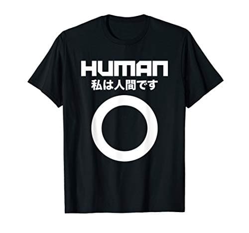
I Am Human Japanese
Kanji “I Am Human.”
See it on Amazon
02
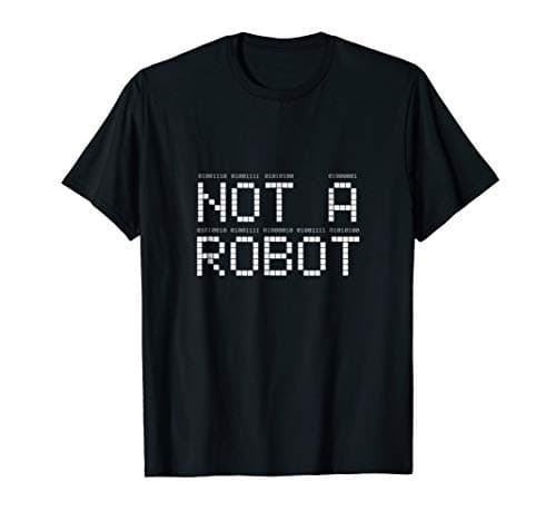
Not A Robot
Binary-line graphic.
See it on Amazon
03
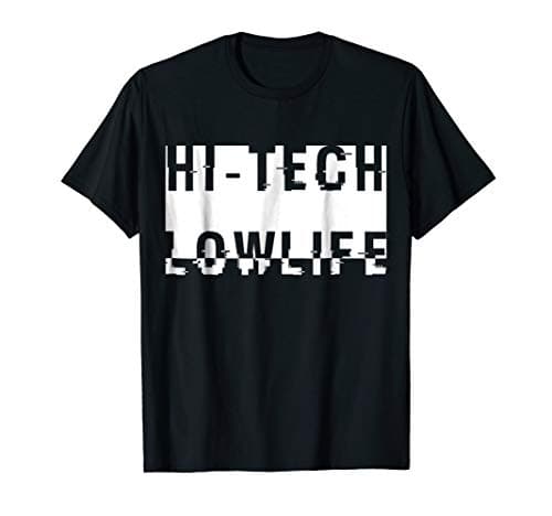
Hi-Tech Low Life Block
Core brand phrase on the chest.
See it on Amazon